Art Direction
As someone whose excelled in multiple creative disciplines, doing art direction and re-branding has come very naturally to me. Clients often approach me to not only take photos for their brand, but create logos, build websites, and even design and build new store layouts.
Learn Scuba Chicago
ARt direction + graphic design + interior design
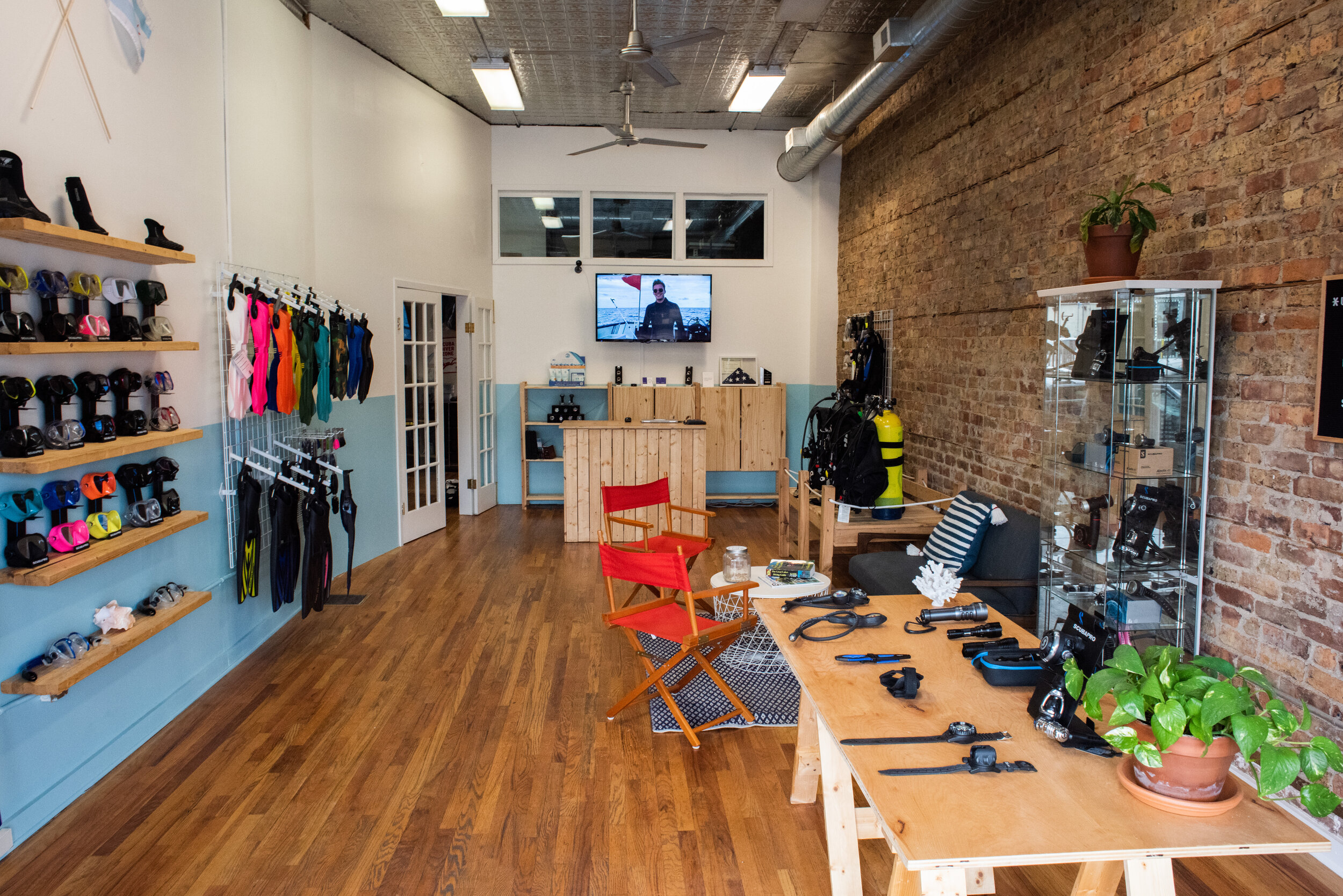
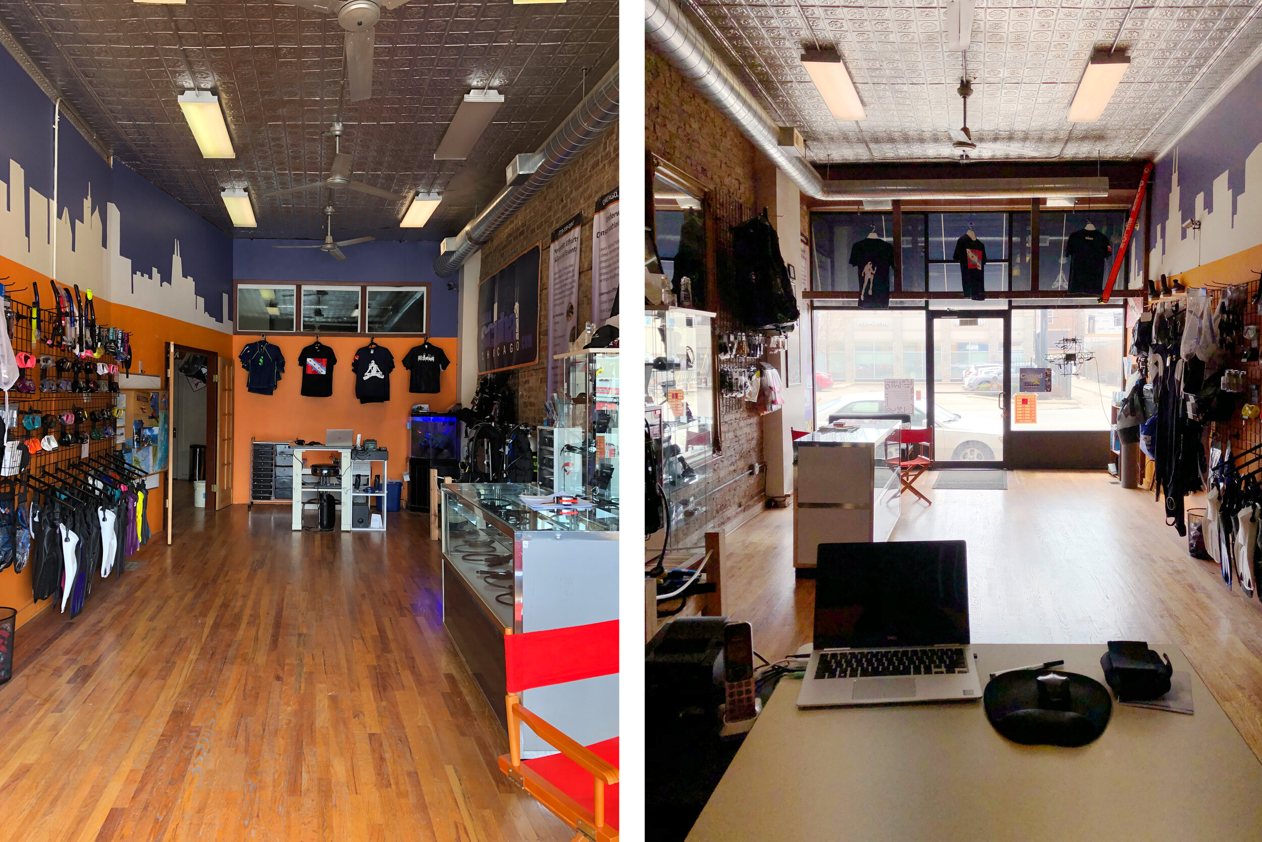
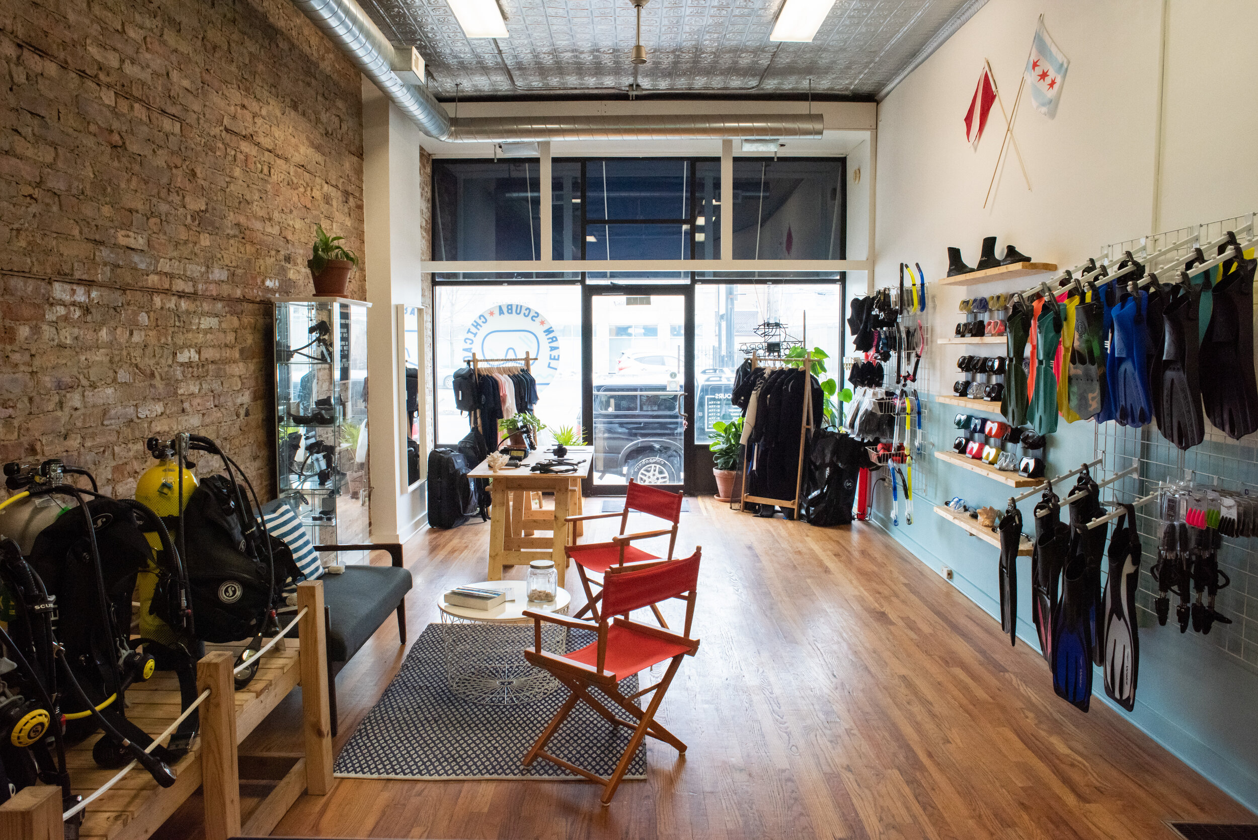
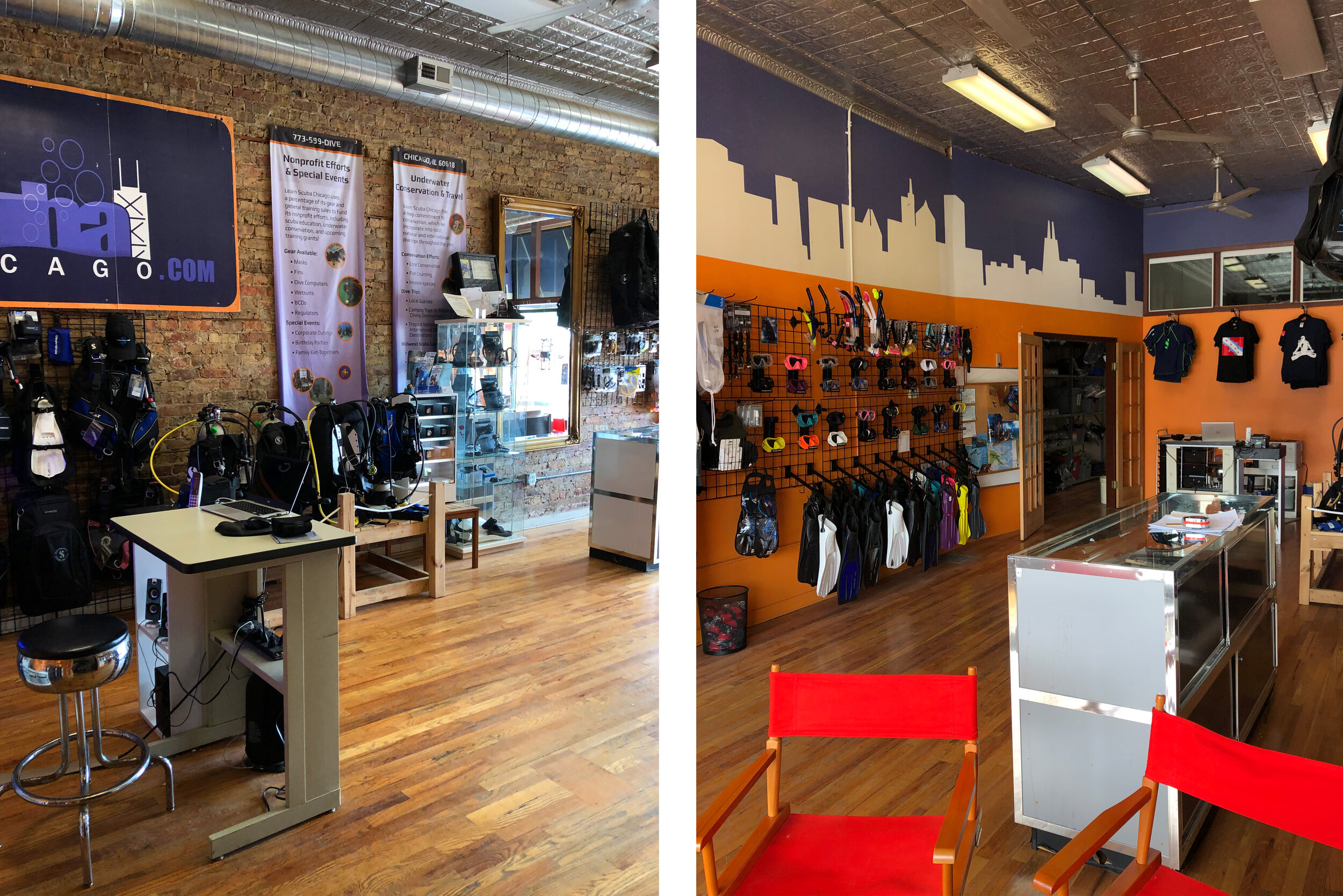
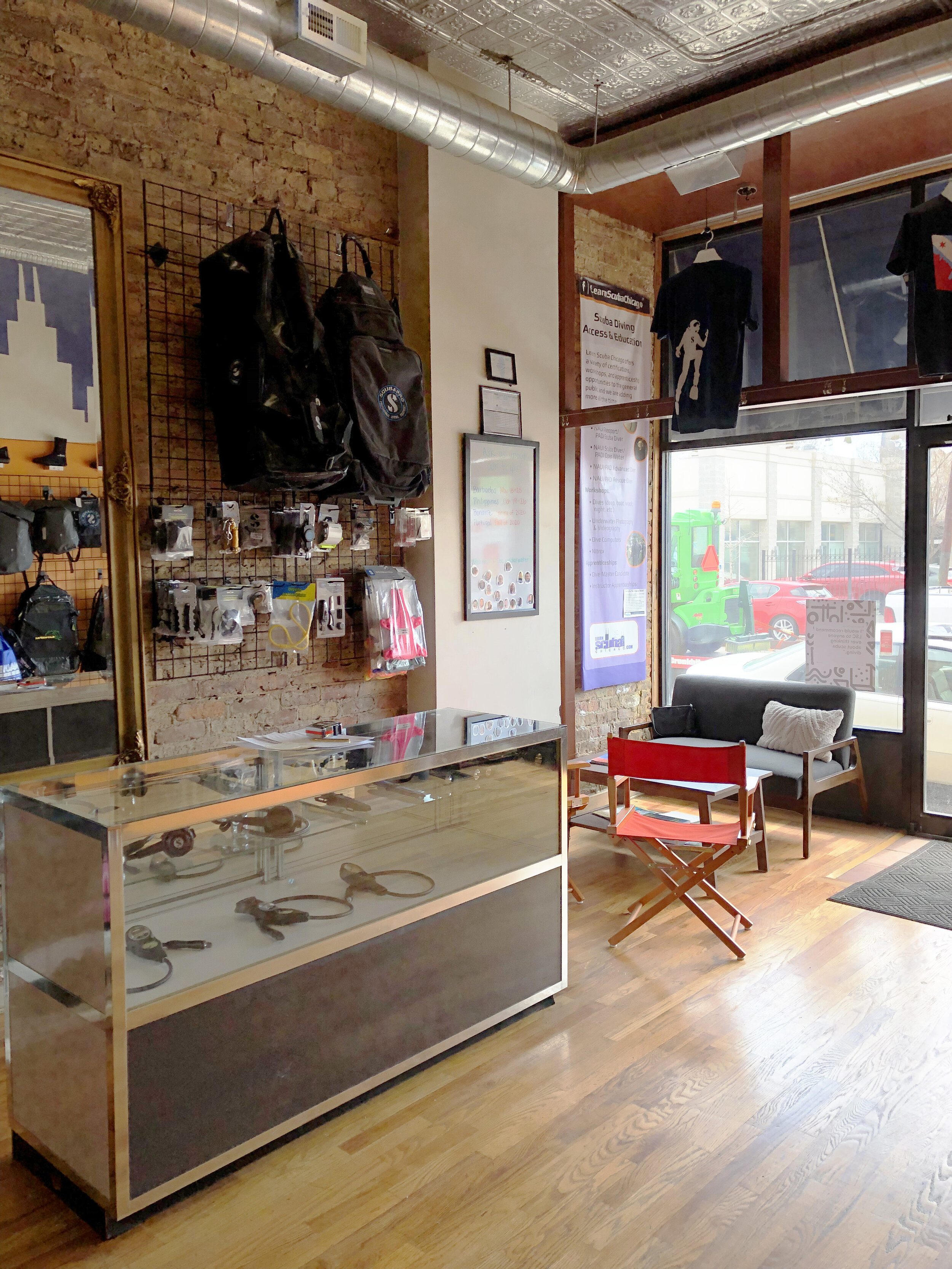
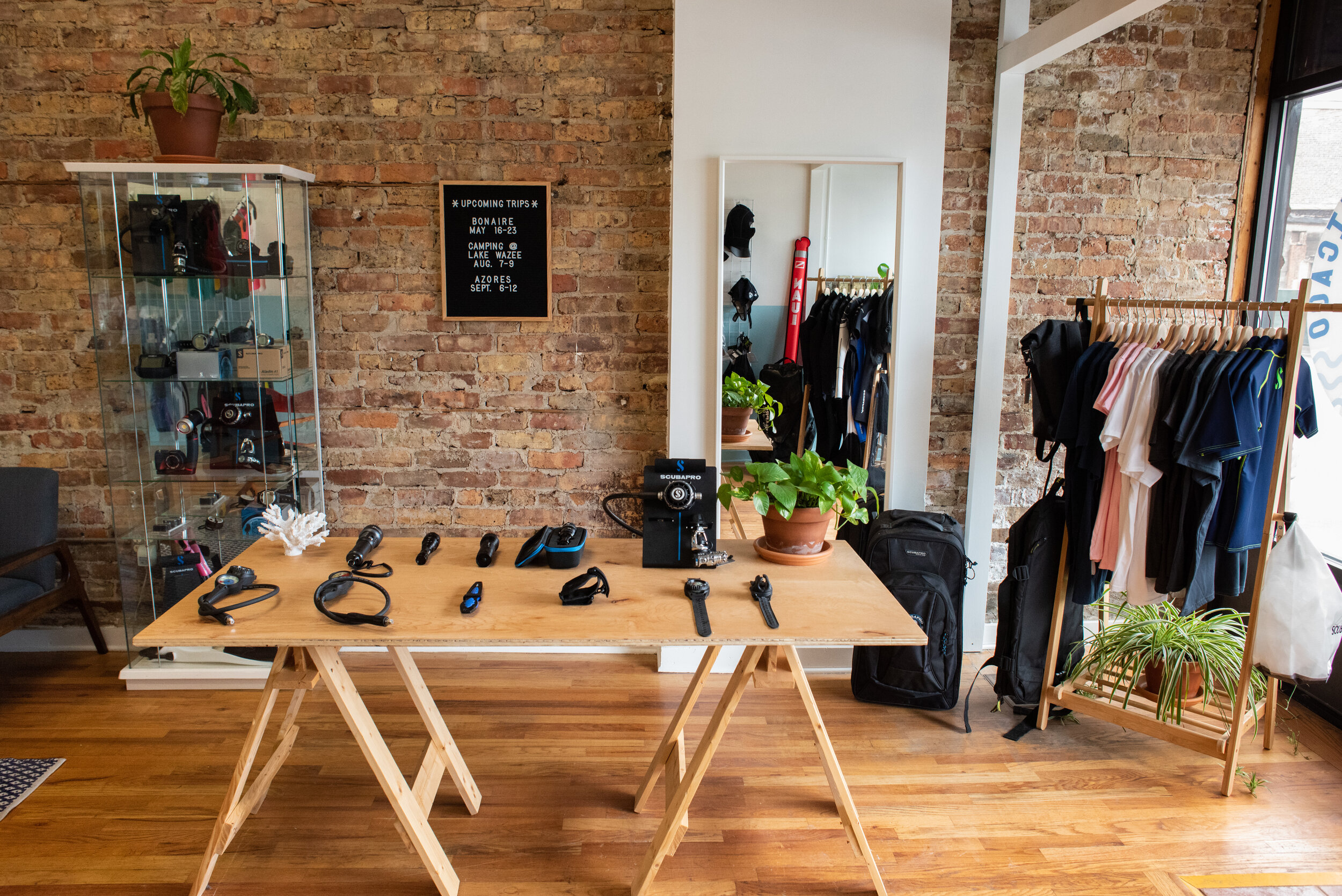
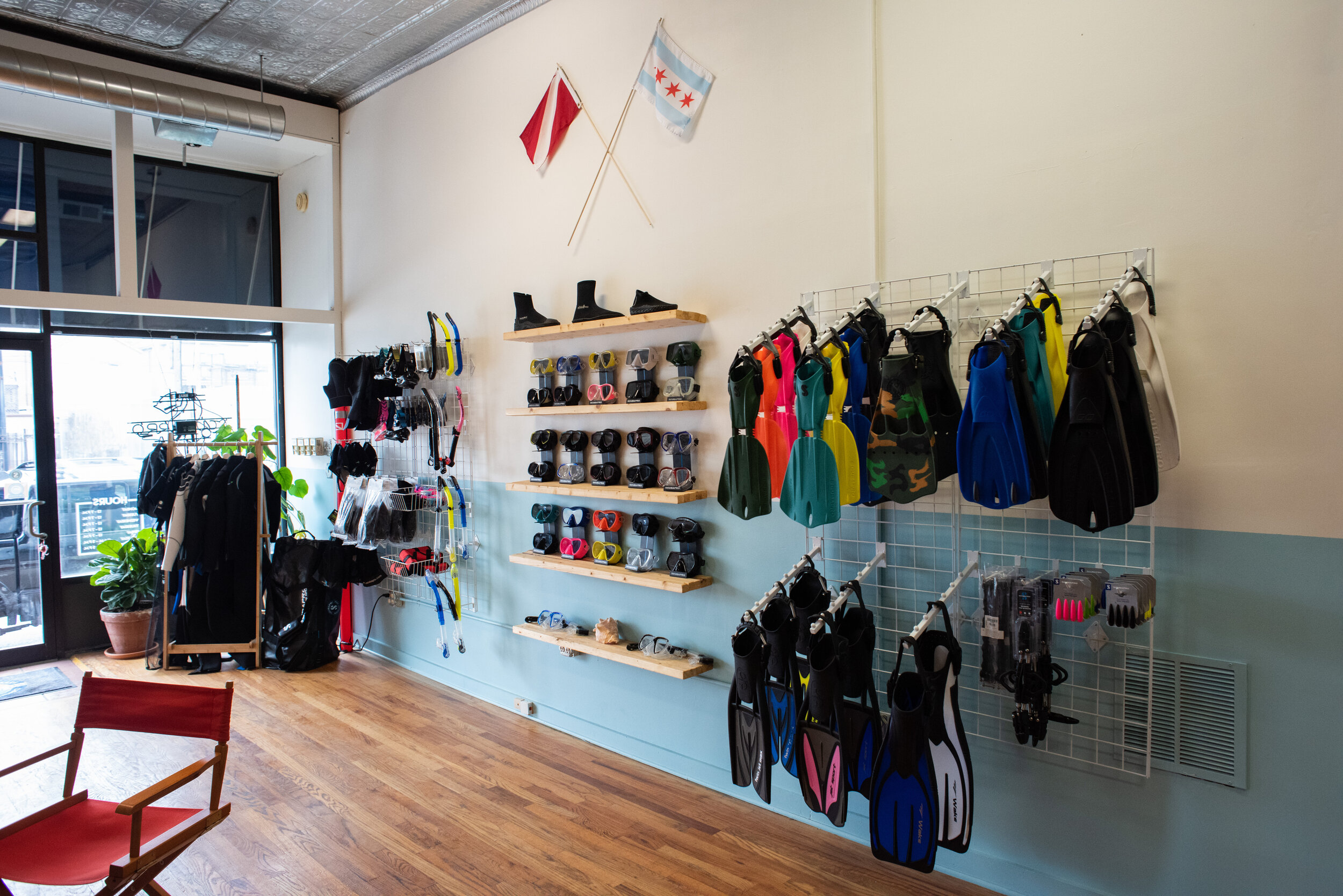
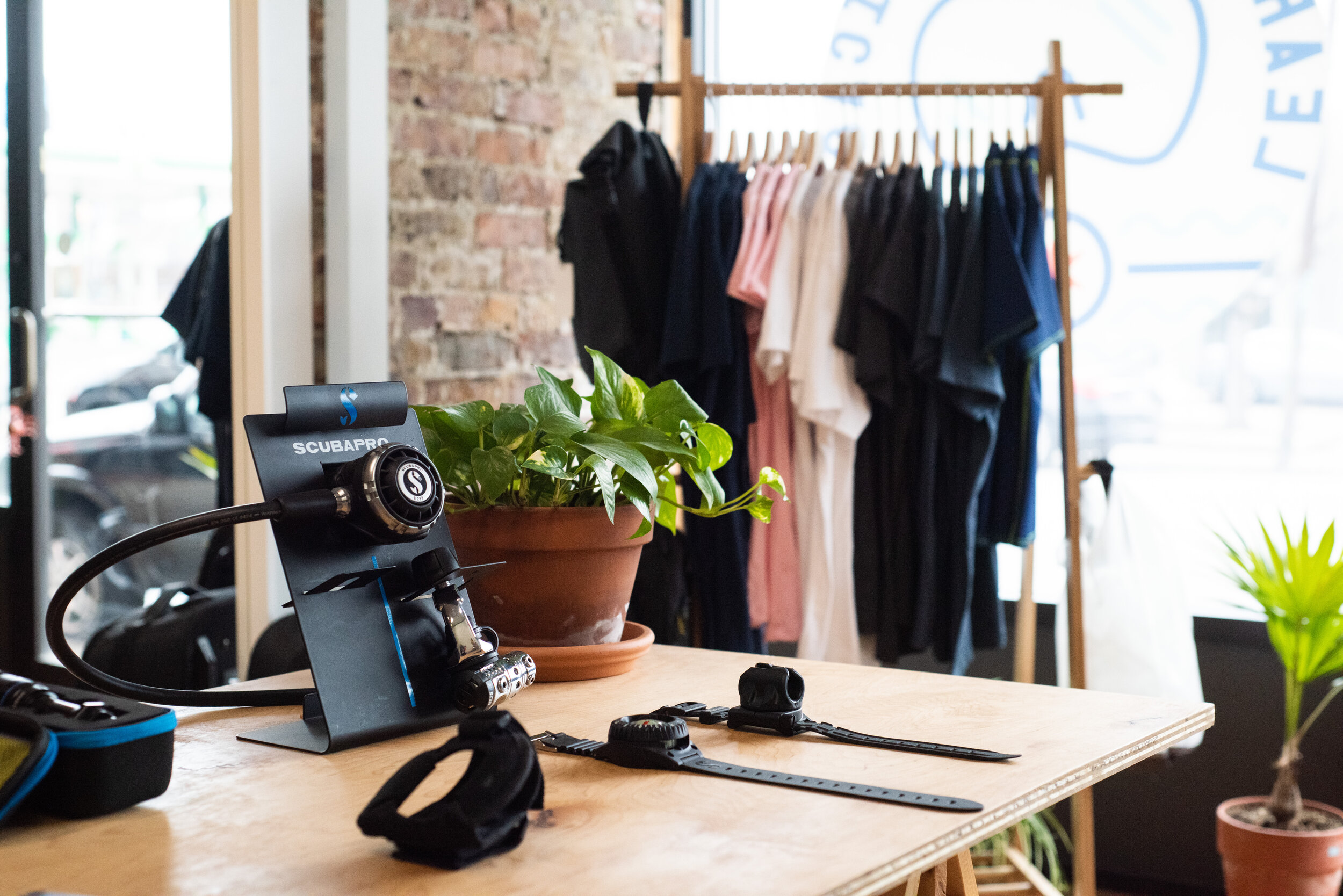
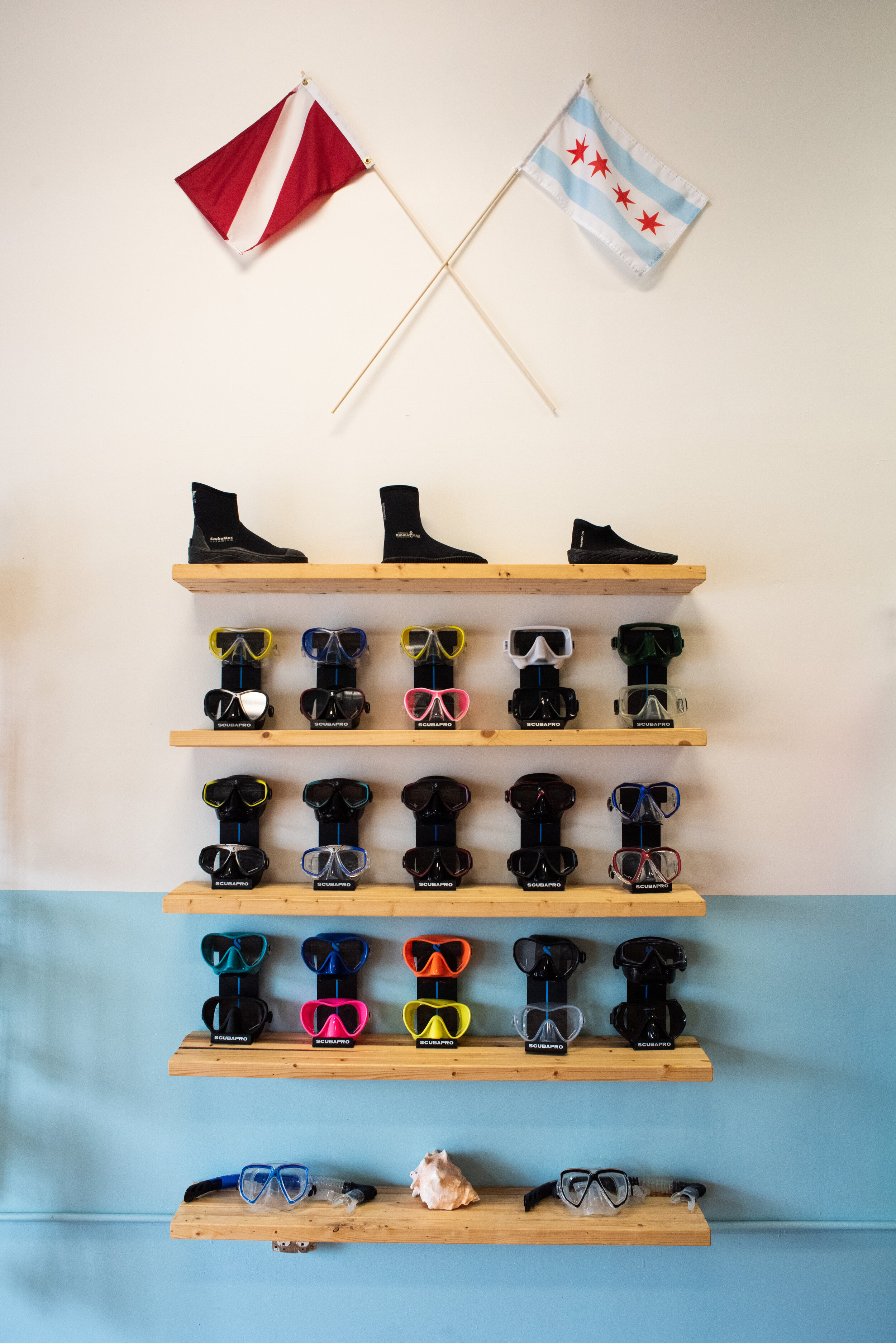
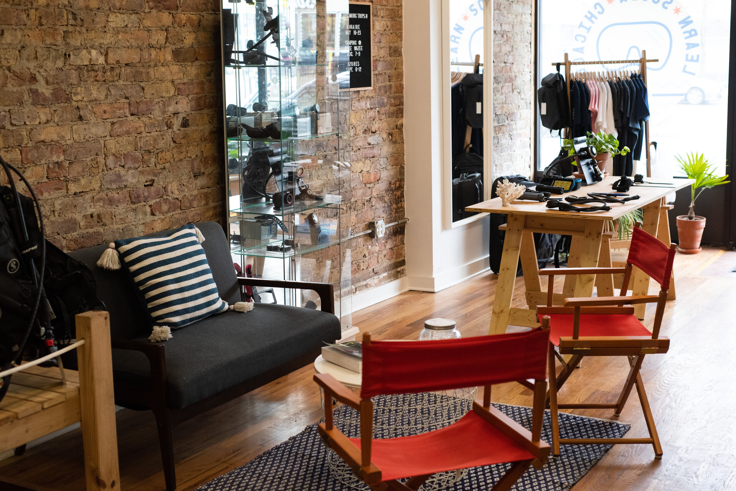
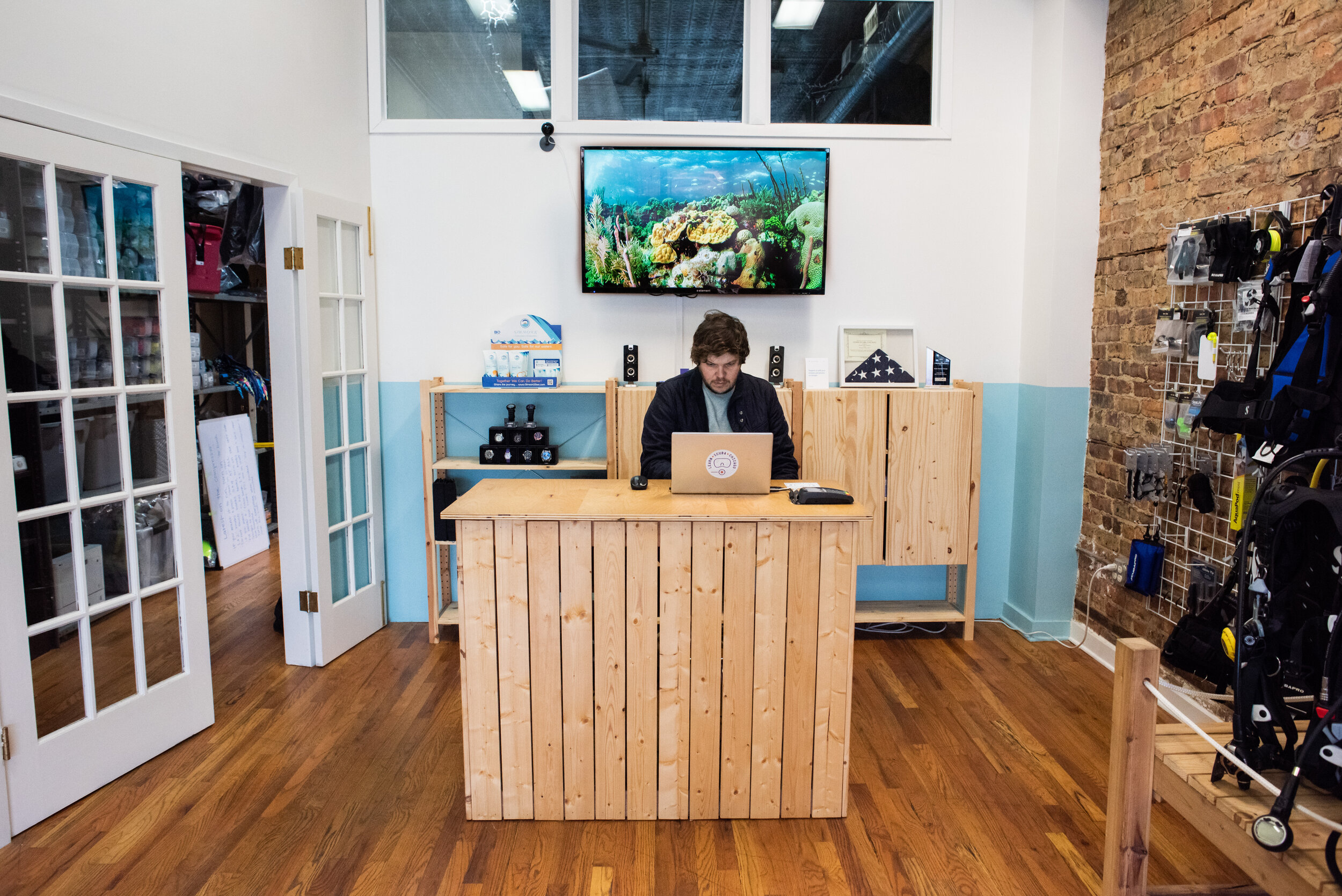
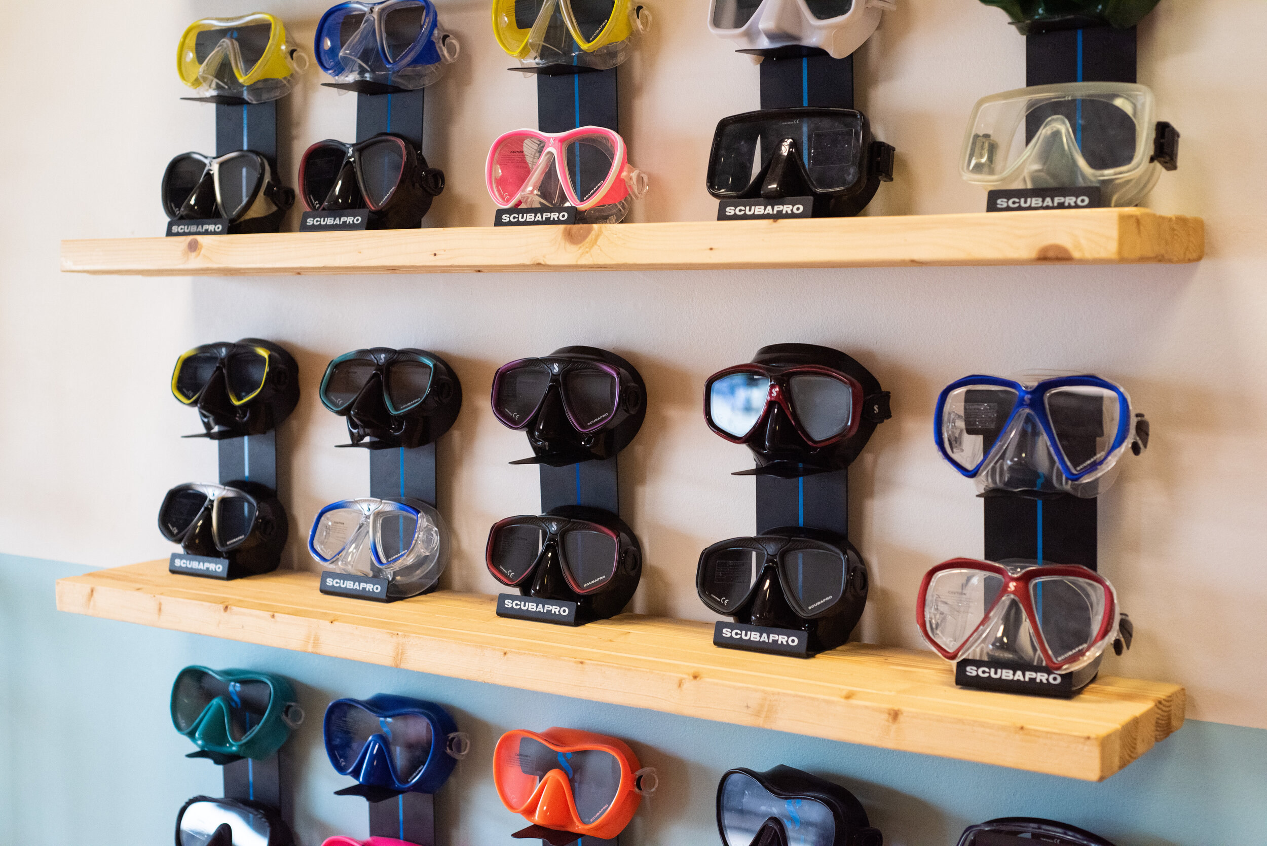
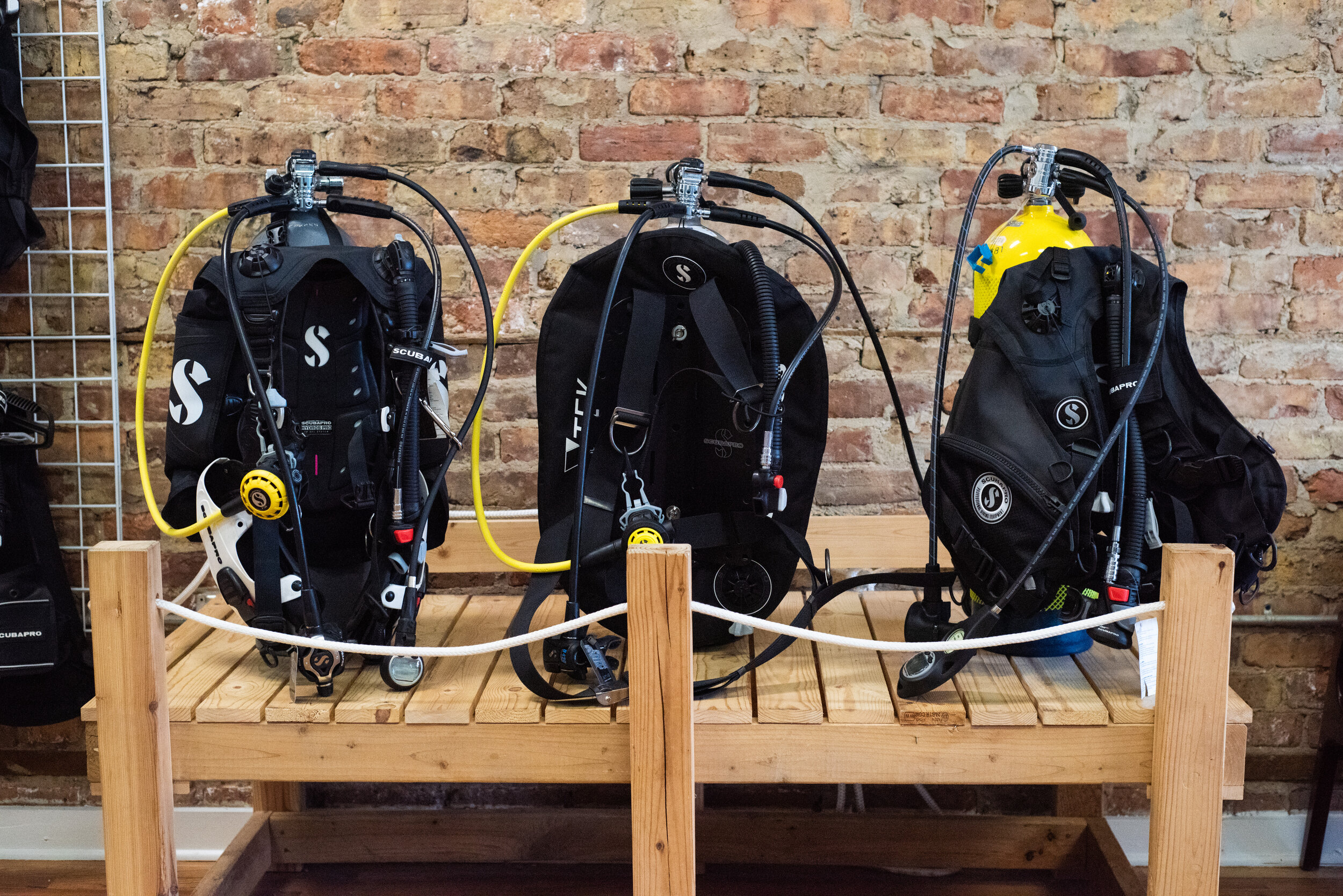
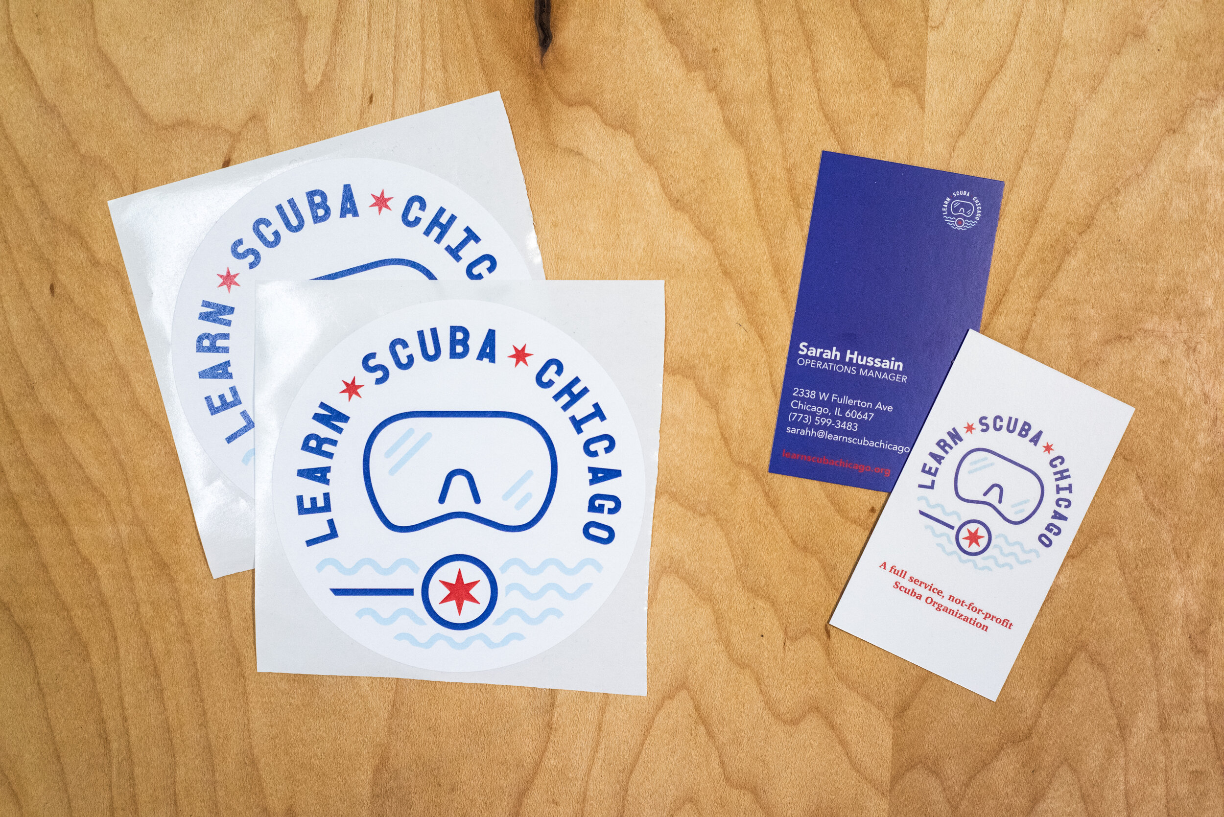
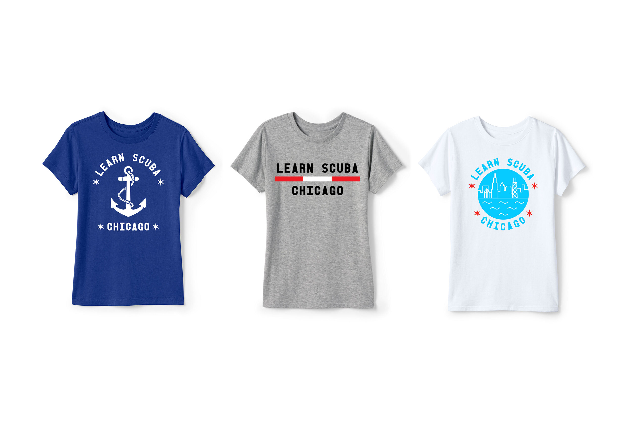
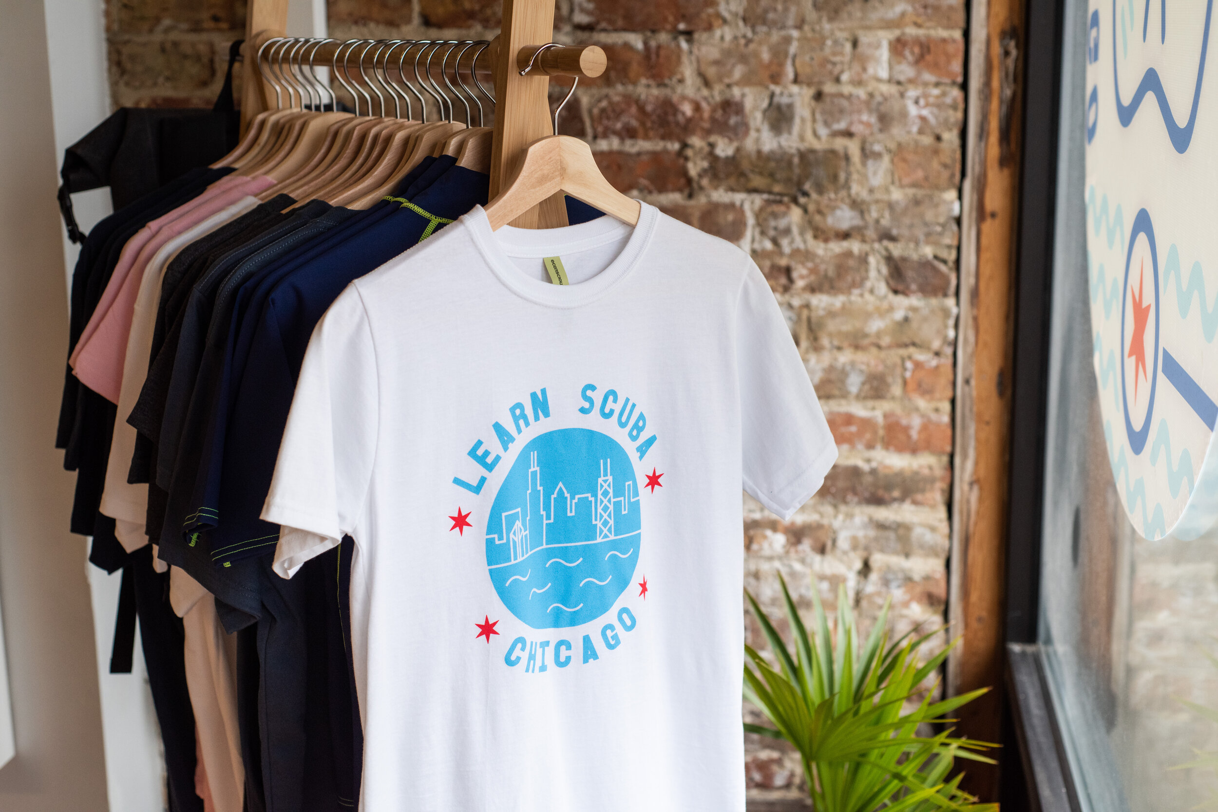
Learn Scuba Chicago, a not-for-profit dedicated to scuba training for underserved communities, was in dire need of a complete brand overall. Their dated visuals (or lack there of) didn’t match the vibrant, youthful volunteer staff that worked so hard to keep it running. This was a unique opportunity to make a fun and thoughtful shop in a cool retail space. For their look, I was inspired by a trip to California in which I visited a surf shop whose youthful edge felt like it would fit LSC, as well as Wes Anderson’s movie “The Life Aquatic”. I not only oversaw all creative direction but was often doing the actual labor myself with help from the staff. I designed new logos, signs, shirts and other graphics. Finally I laid out and curated a new store layout and interior with new displays and an array of wall decor and plants.
Honeycomb Salon
WEB DESIGN + graphic design + PHOTOGRAPHY
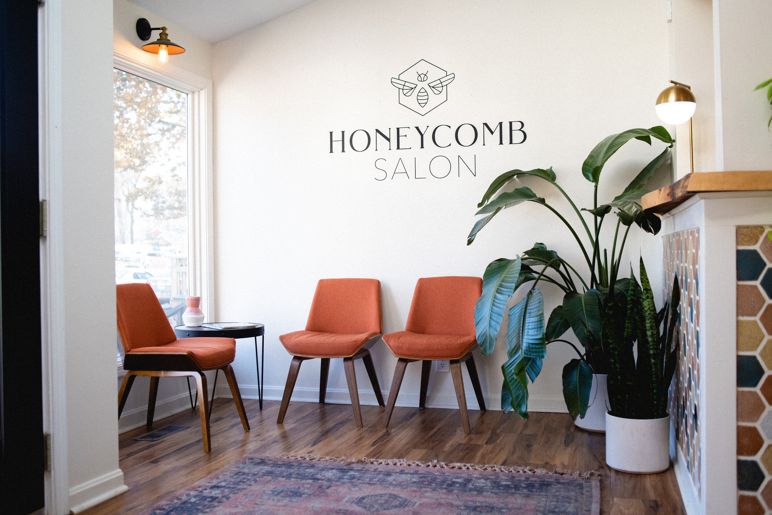
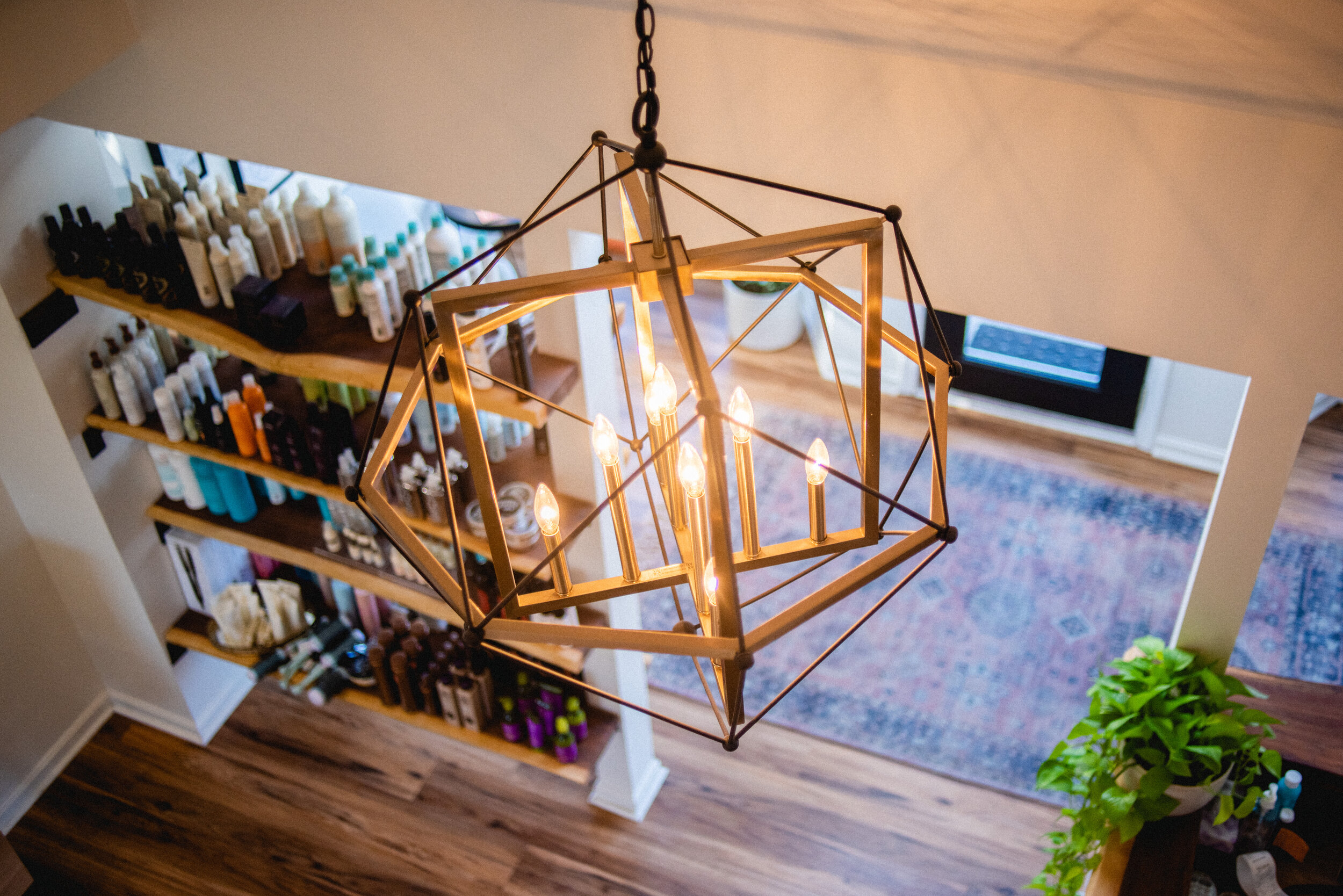
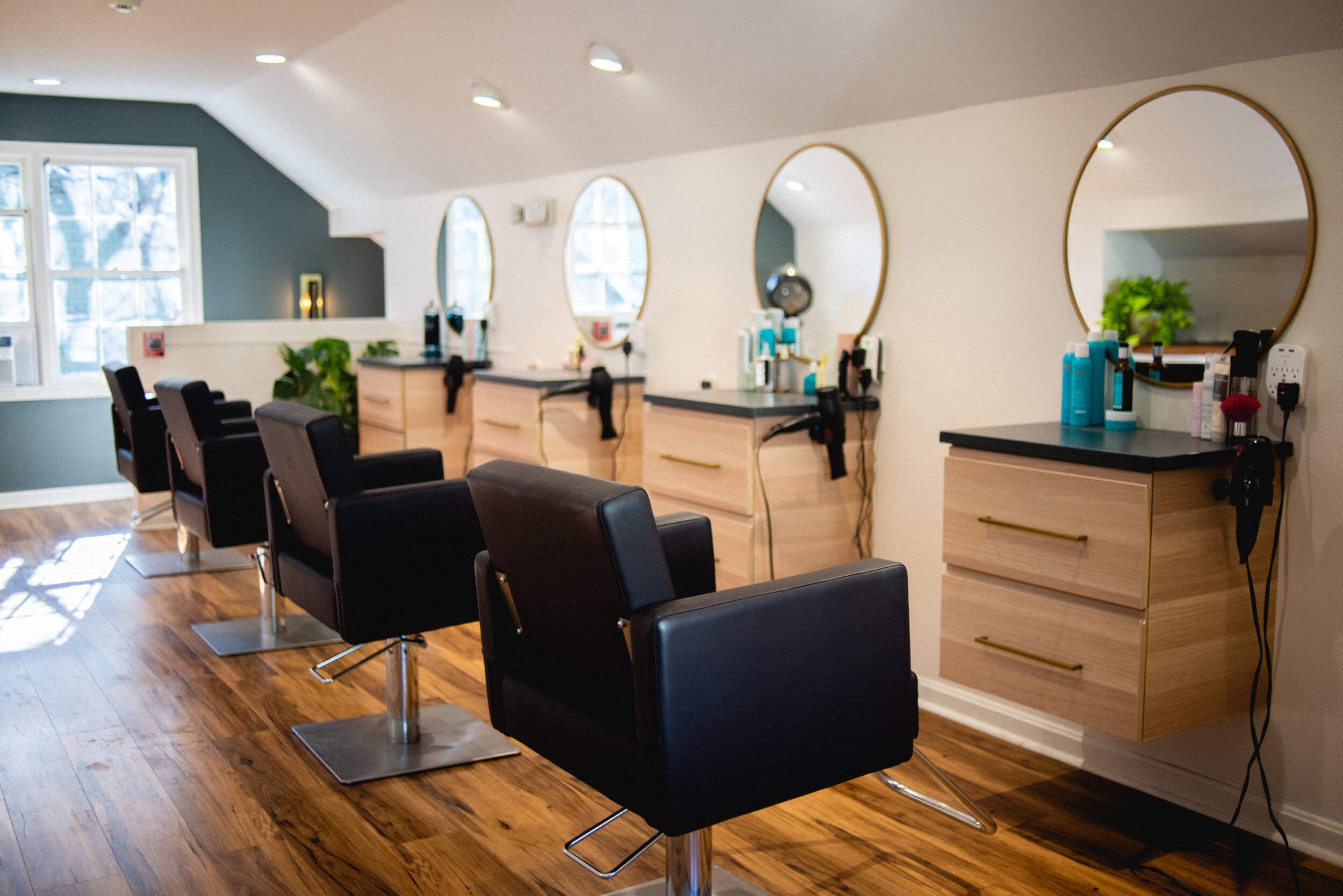
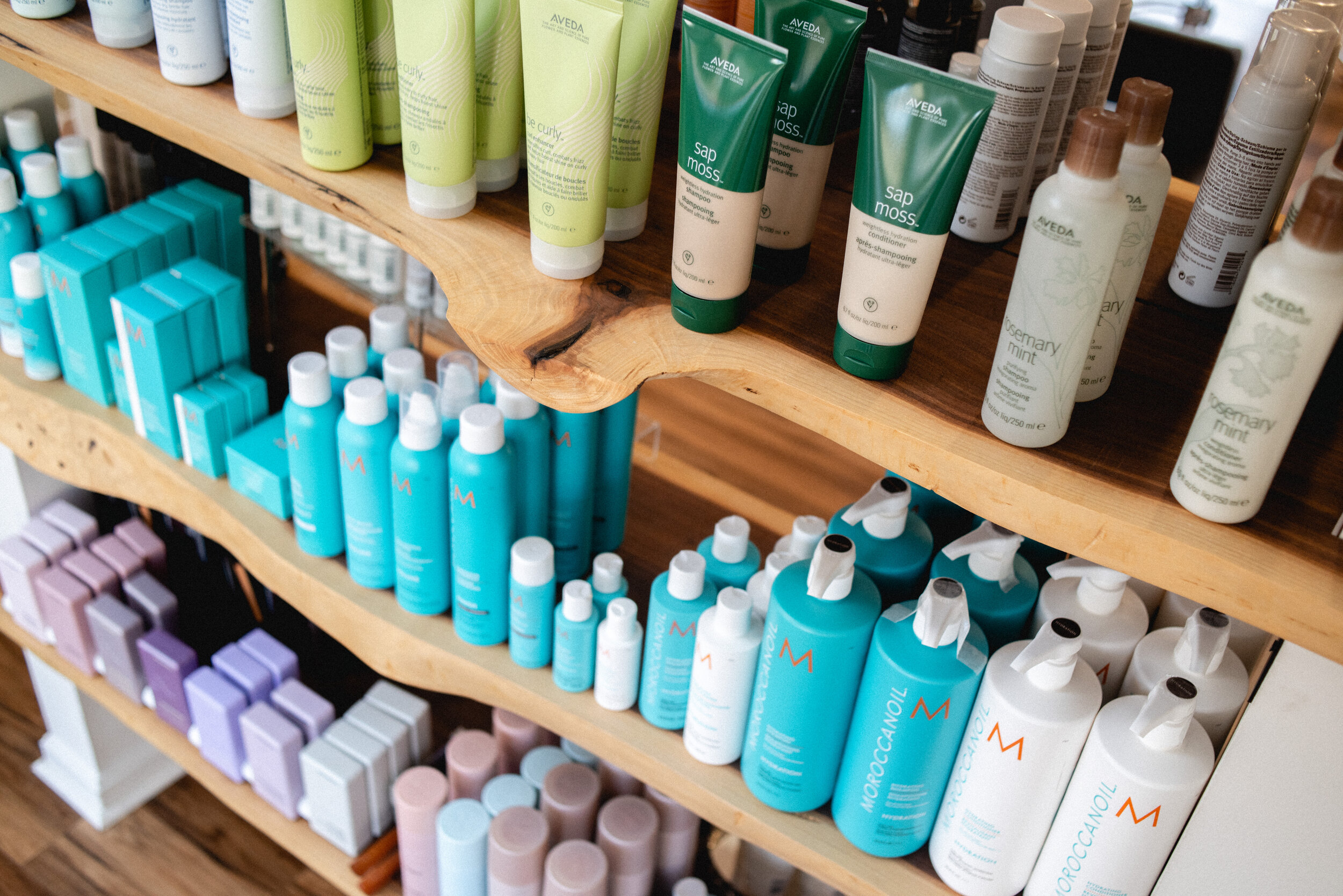
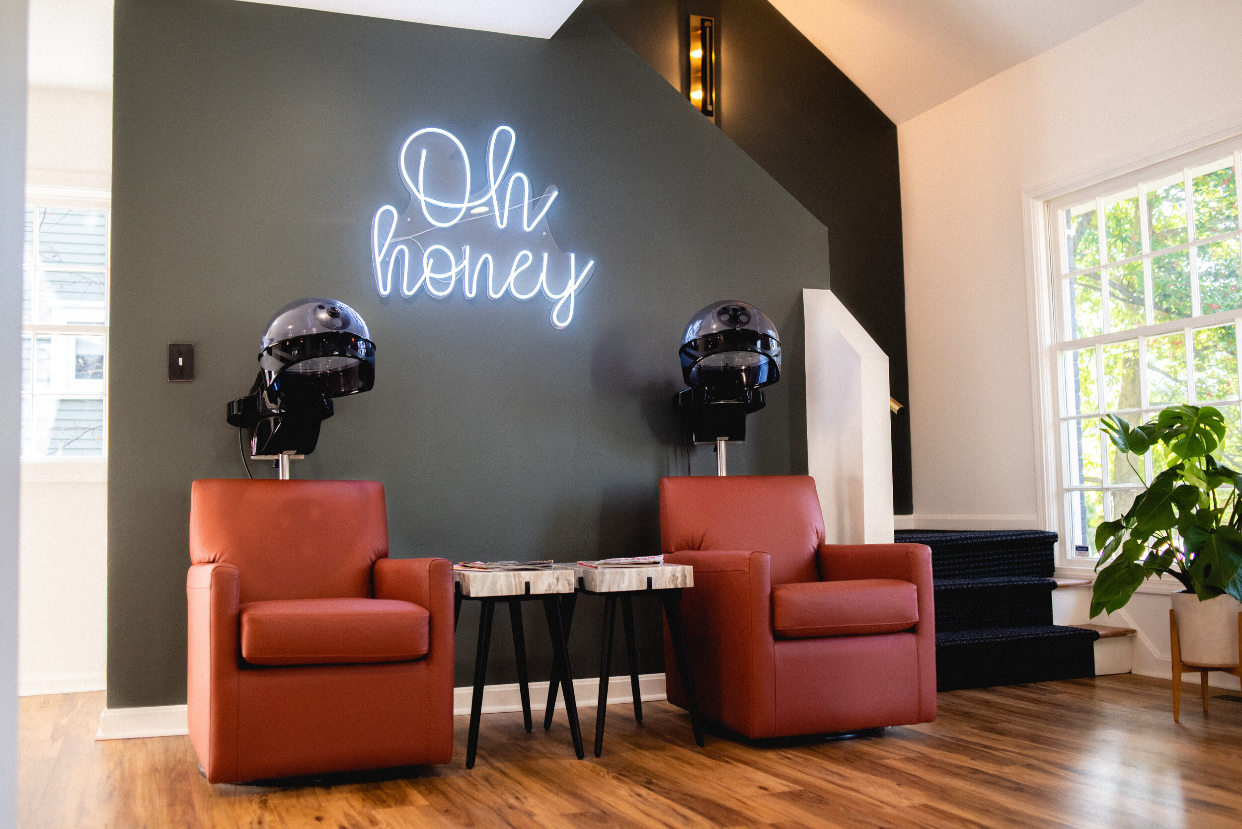
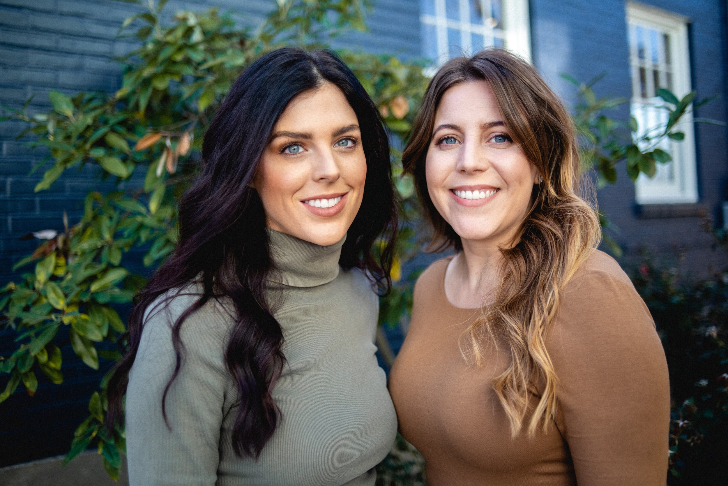
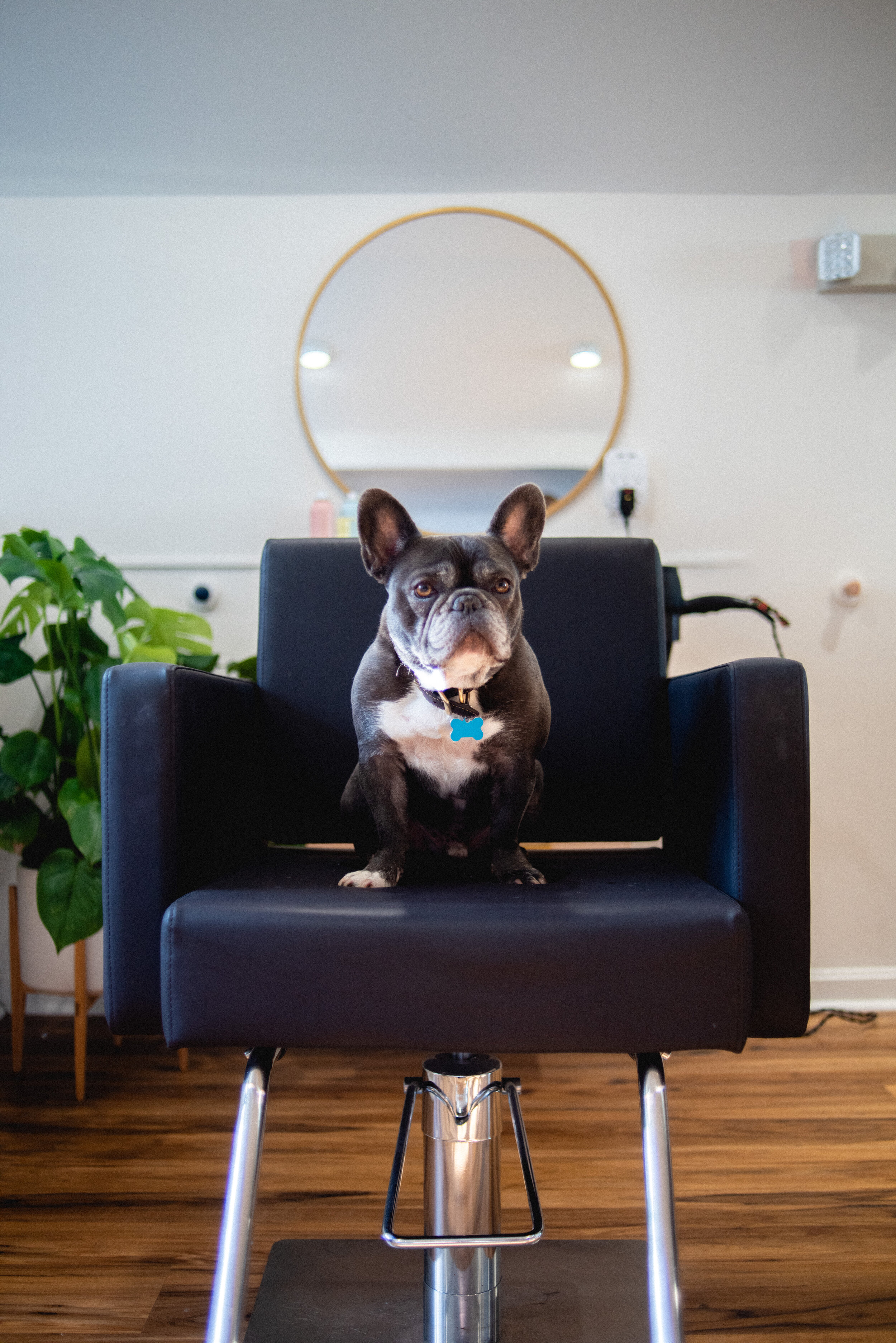
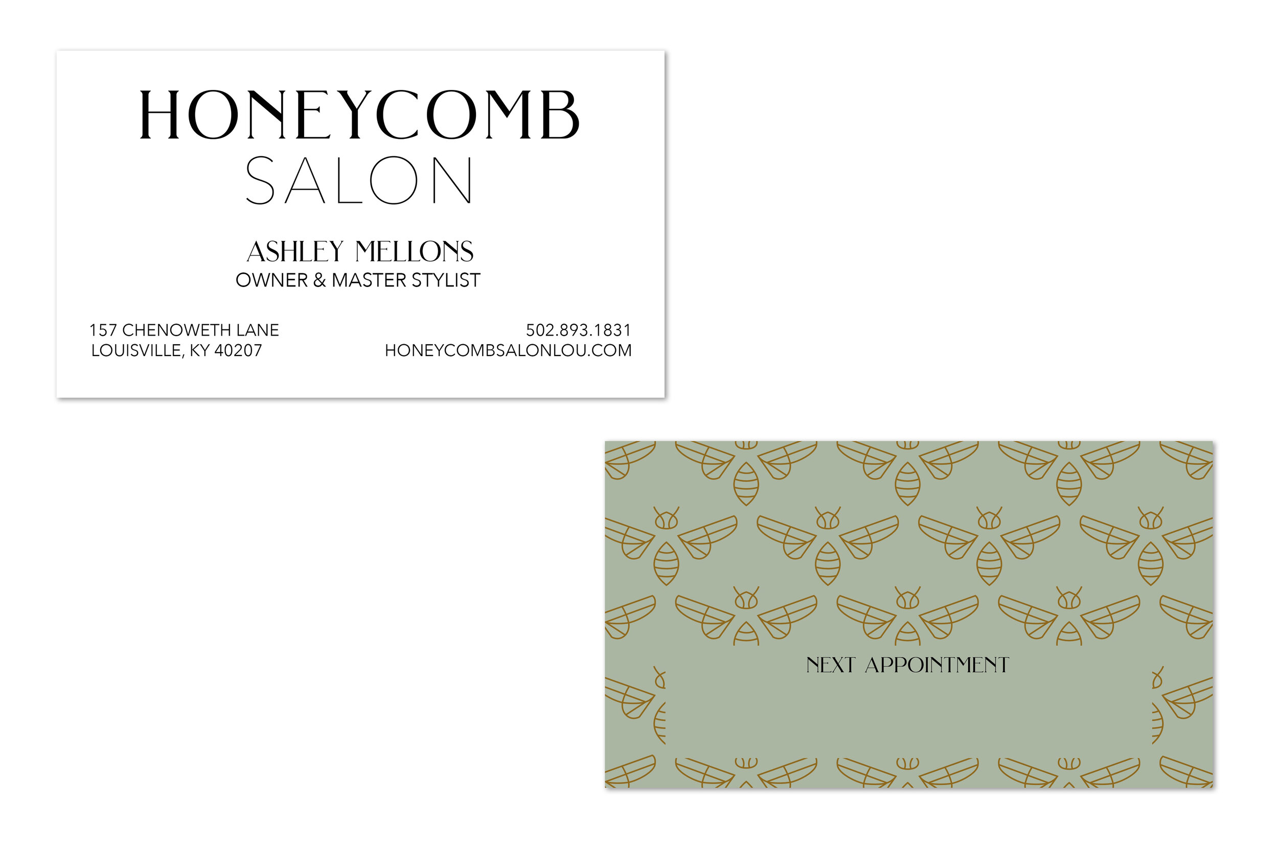
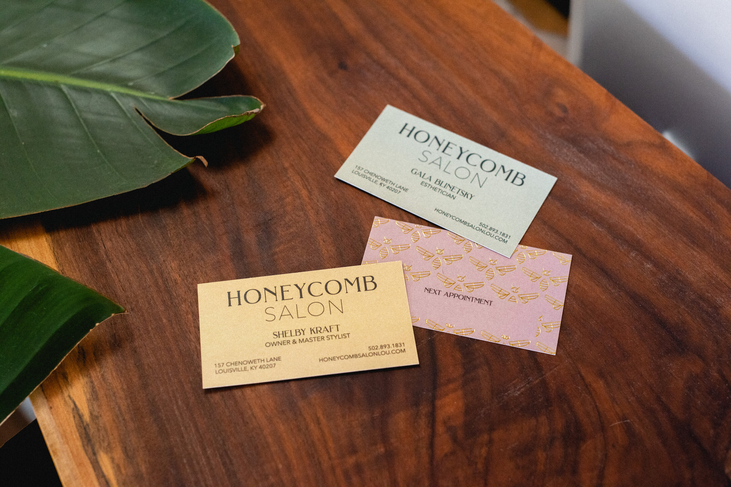
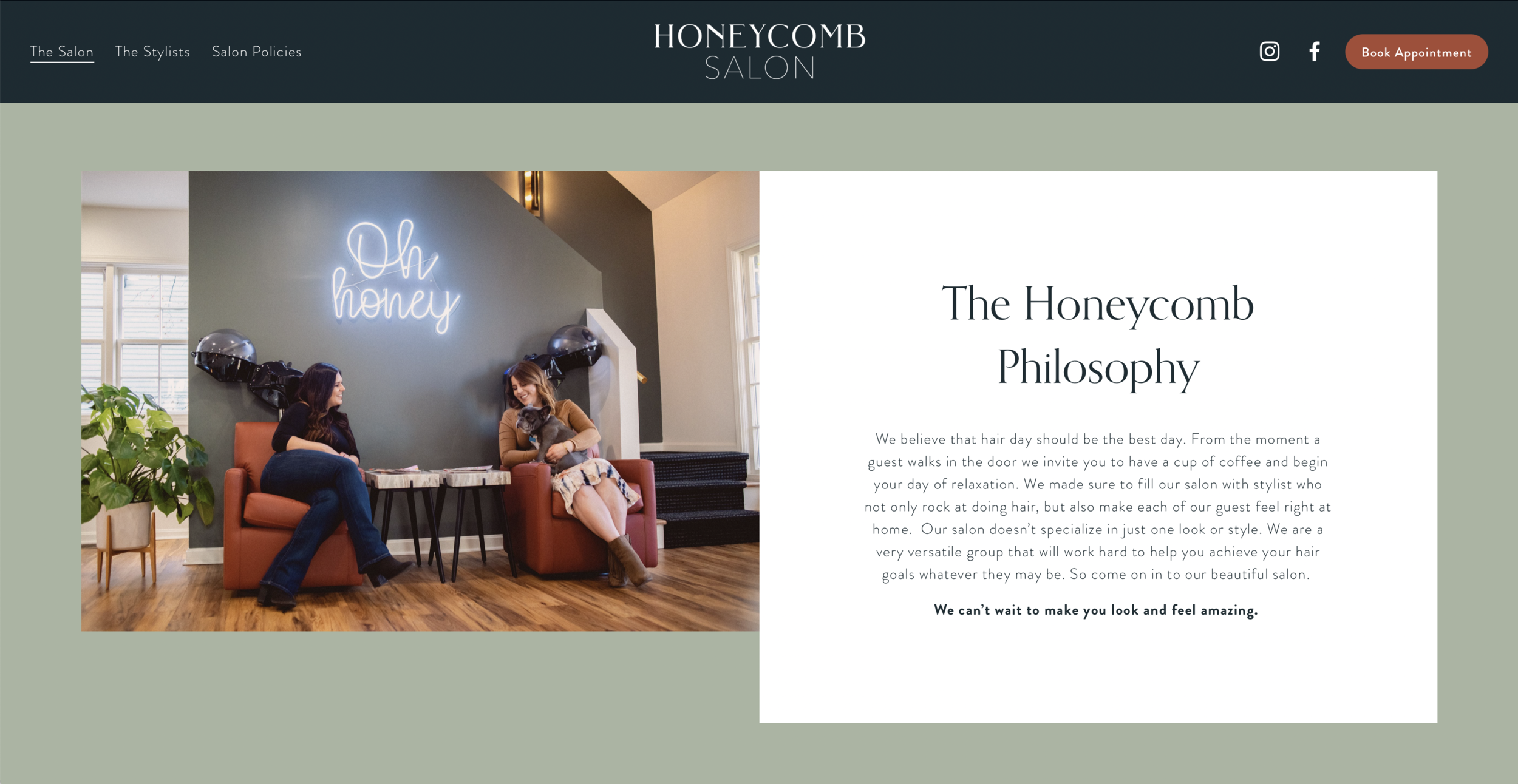
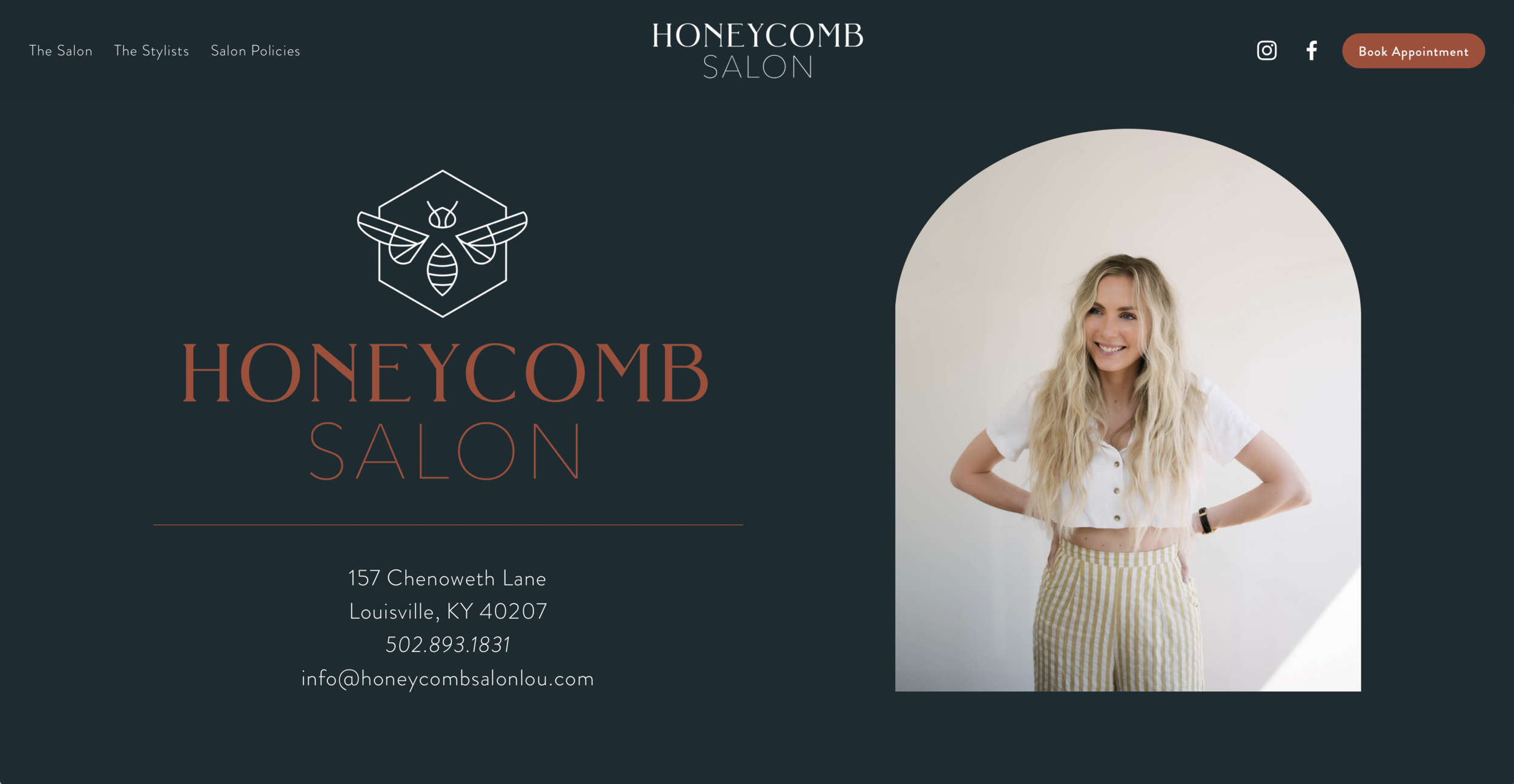
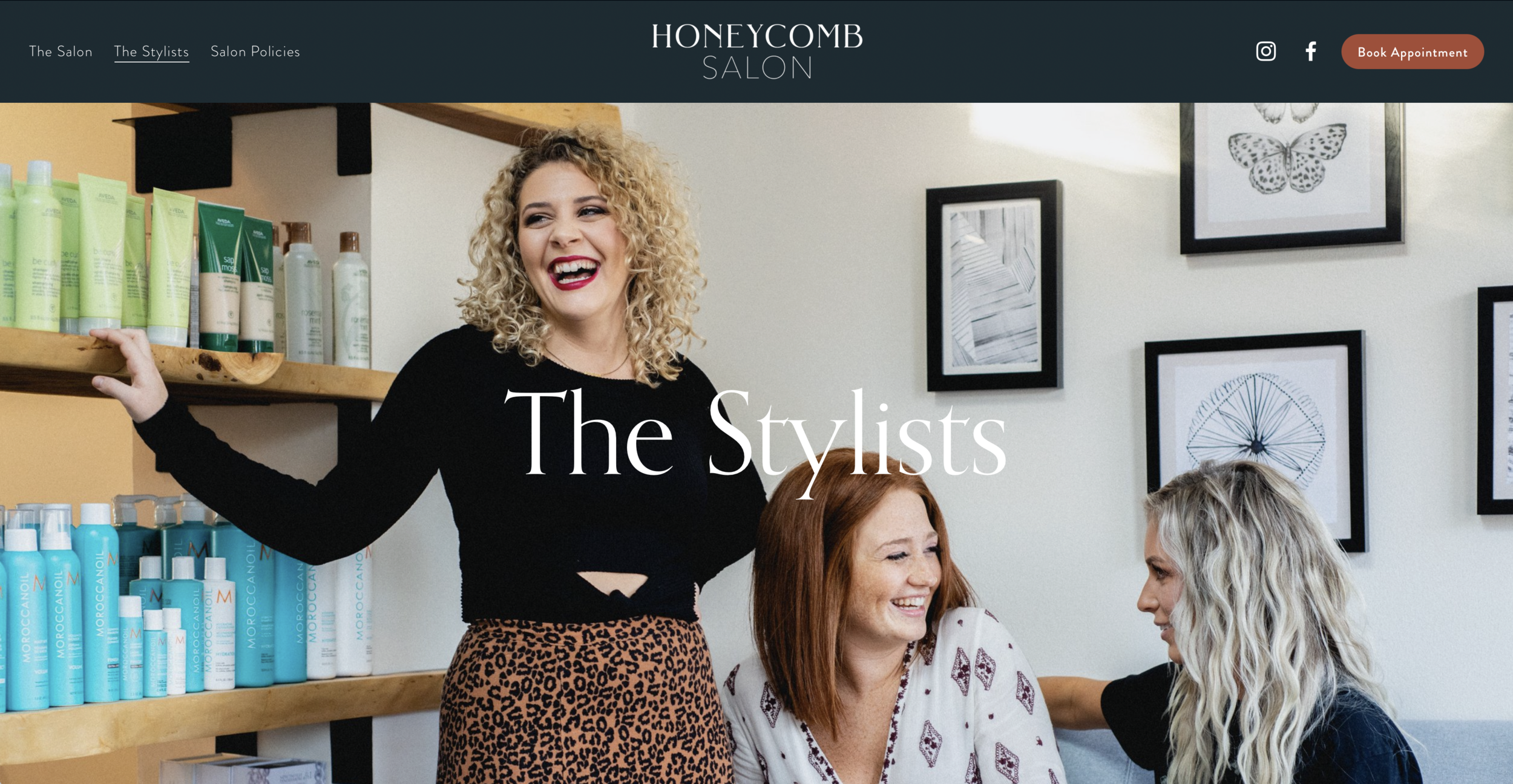
When Honeycomb Salon upgraded to a bigger space in 2019, they wanted to upgrade and revitalize their branding as well. Taking inspiration from their gorgeous new space and interior design, I created a sleek and minimal new logo, colorful sets of business cards and revamped their website. Once construction on the new salon was complete, I photographed the new space for use on their website as well as headshots for all of the staff (including their beloved shop dog Mr. Wilson). See the website here.
Perspective Psychology
web design + graphic design + photography
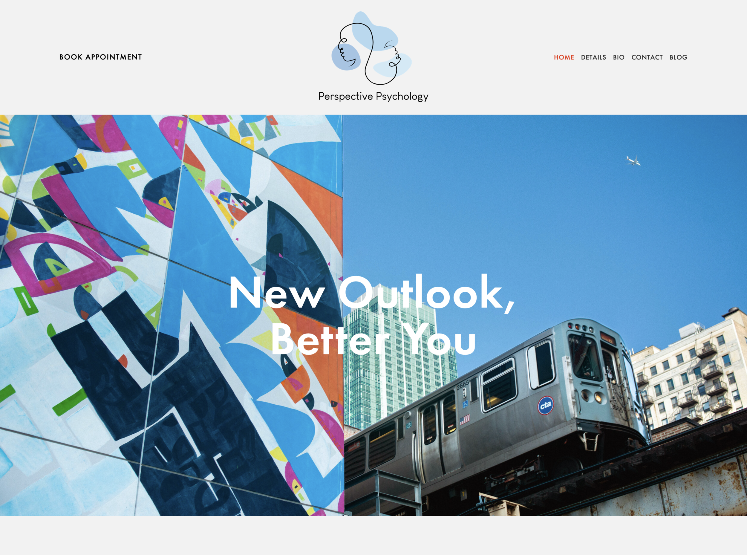
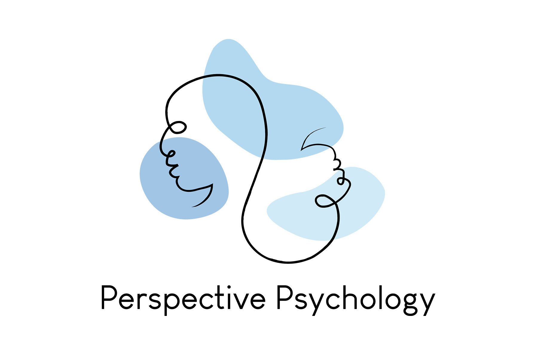
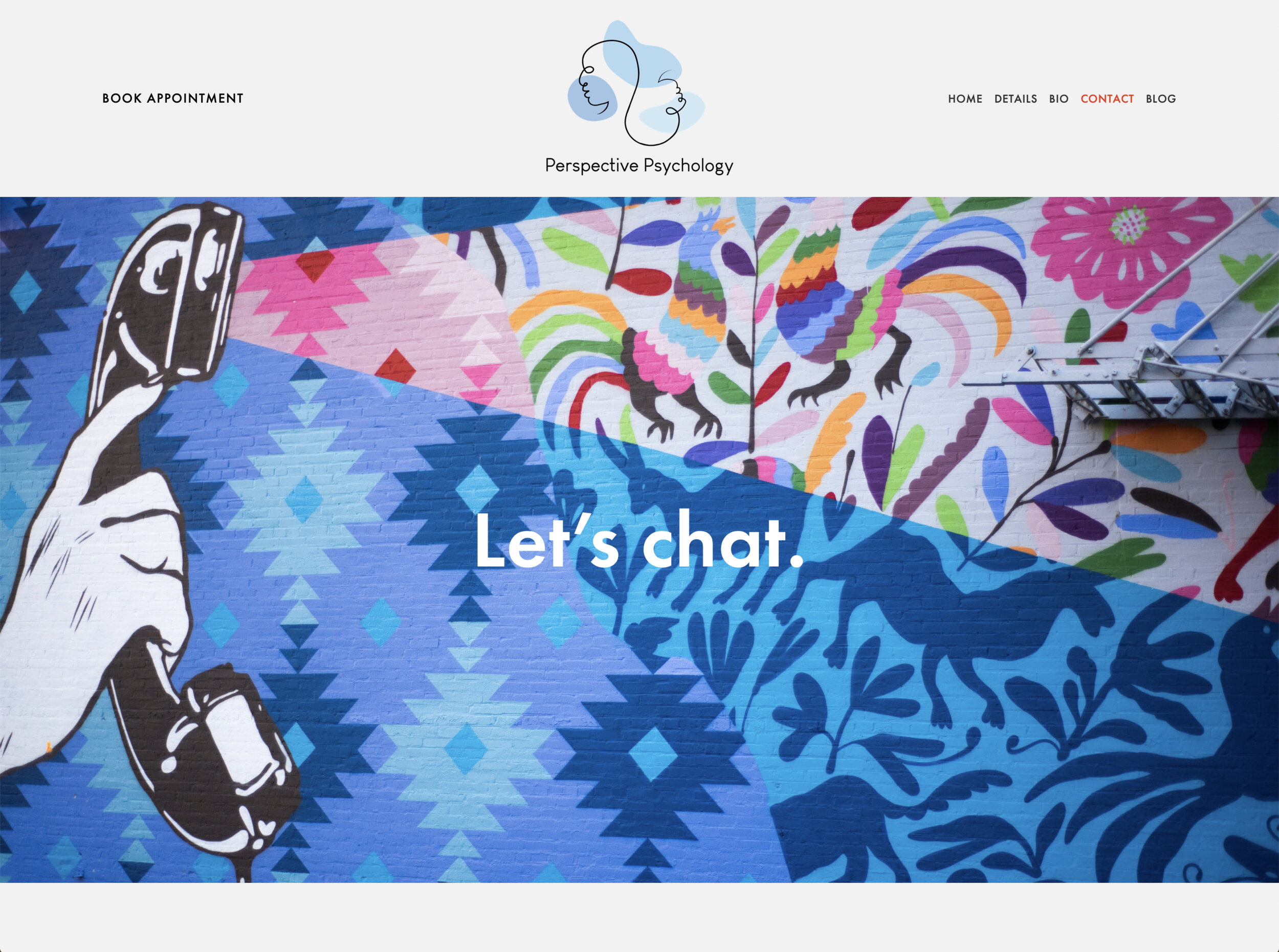
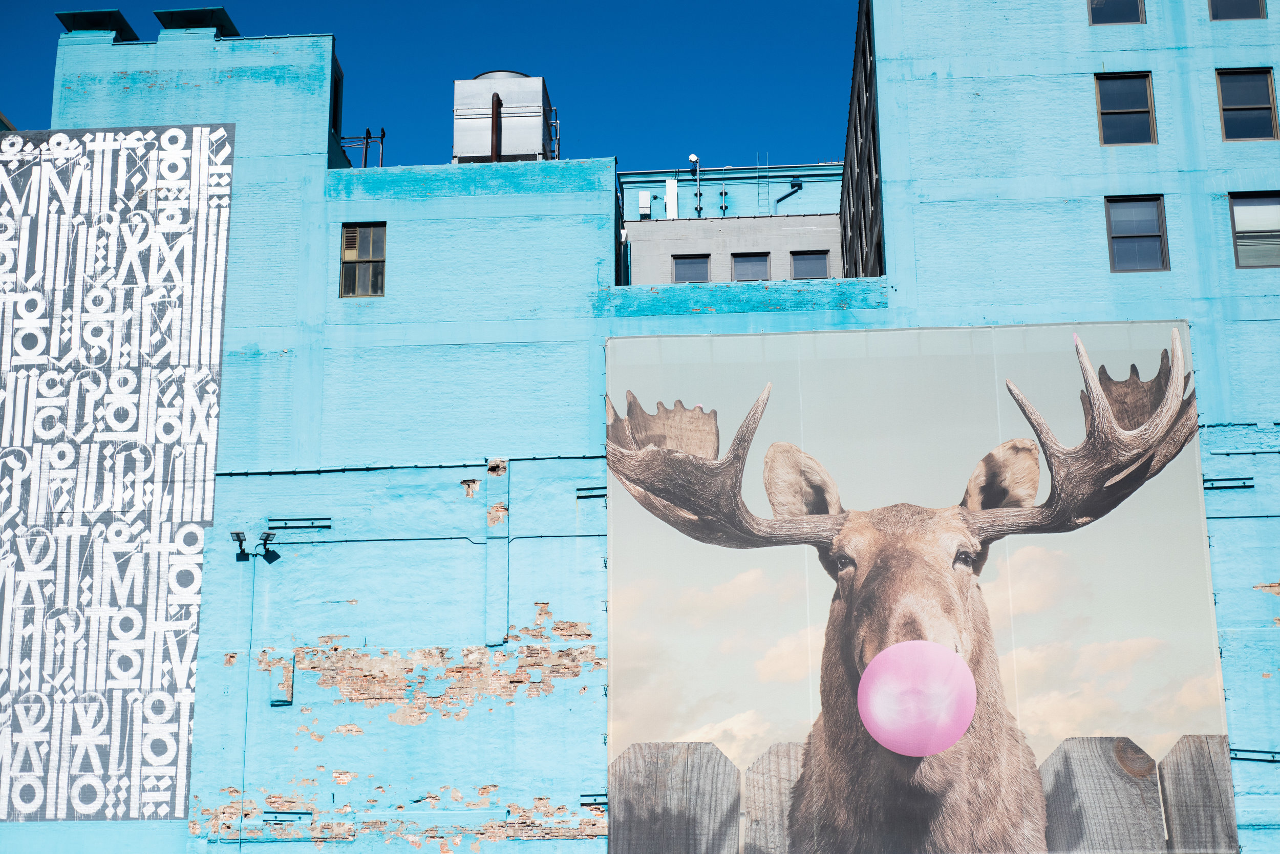
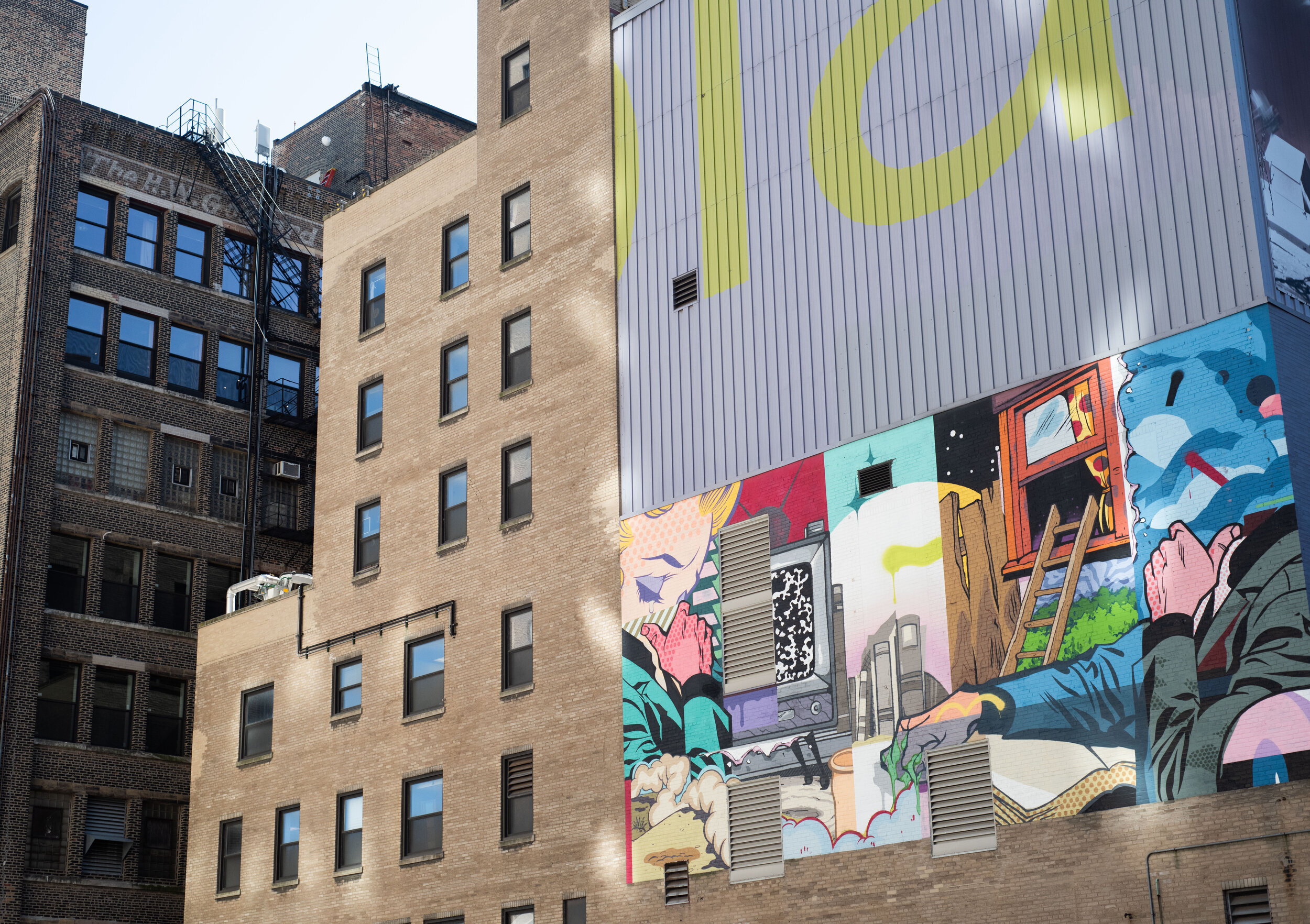
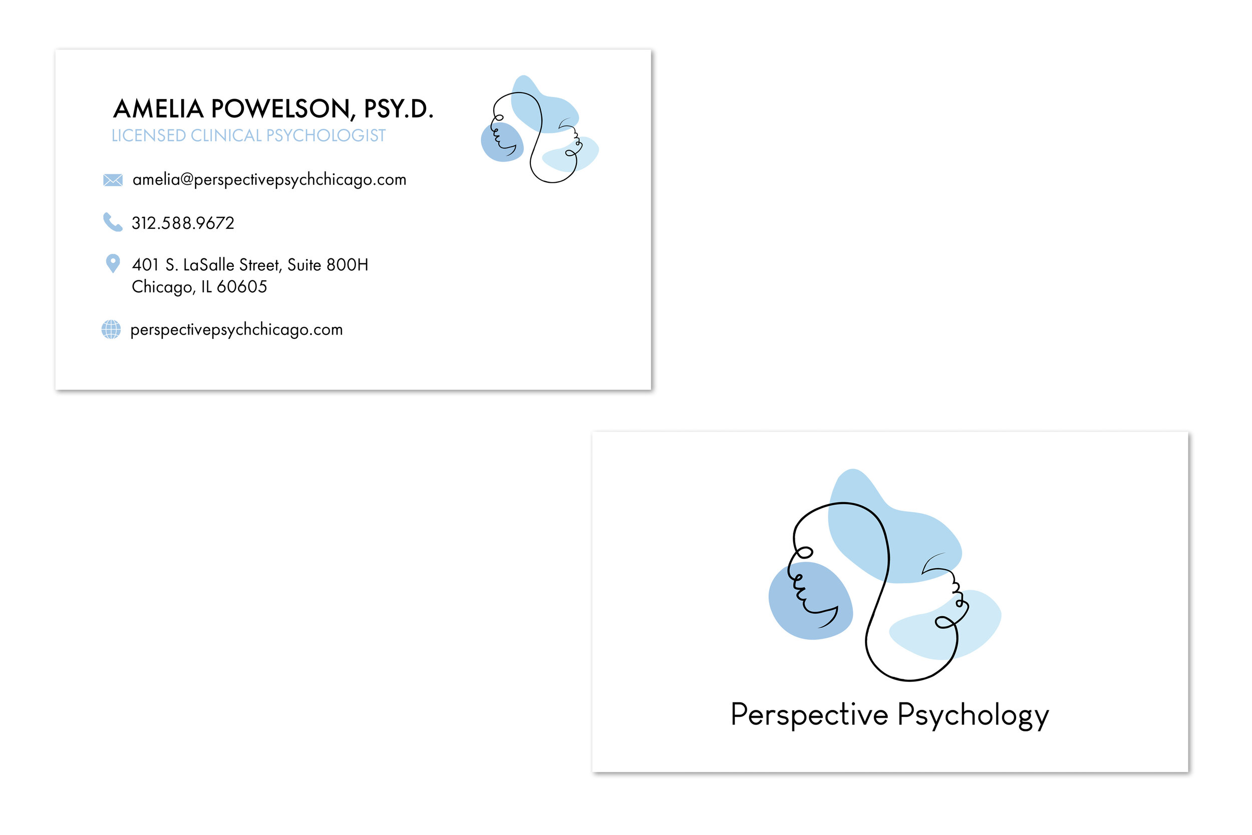
Amelia was a therapist looking to start her own private practice when she approached me. Her branding was completely fresh, she wanted not only headshots, but a website and an original logo. She wanted something that would appeal to the younger more creative crowd that she was serving, and so I drew inspiration from art history and the cities well known street art to create a unique site for her practice.
